
Labflow Introduces Data Insights

Lab courses are complex learning environments where students are often at least one degree removed from you as the lab coordinator/instructor responsible for administering their learning. The Data Insights component of Labflow is our first attempt to deliver a broad set of tools that can help you manage your lab courses more effectively from day one through reporting final grades.
One of the crucial components of running a successful lab program is making sure your instructional proxies in the classroom are providing students with timely and fair assessments of their work. Getting this right is tricky, but we have developed a number of data views within Data Insights that we believe will help you get a better handle on how important aspects of your course are running.
Each Data Insight view has a similar layout that includes the following:
Title: The name of the data view and which lab report is being analyzed
Insights Abstract: A brief abstract to explain the takeaway contents of that data
Detailed Summary: A granular look at the data that underpins the insight, with tools to interact with that data (e.g., grader/section toggle, filter, sort)
Here are five ways that Data Insights can help you understand how your course is being run:

1. Track report grading status
Grading progress may be the first sign that something is not running as intended. A student who does not know that they are failing to grasp something may continue on unaware that there is a problem if they are not being properly coached by their TA at the right moment in their learning. The Grading Status tab was designed to give you a bird’s-eye view of grading progress on each of the reports in your course. We can see in the following graphic that two TAs look like they still have some outstanding work to do. The number of students who are affected by this delay is relatively small (1%), though this may prompt you to follow up with these graders and make sure that their students are not being disproportionately affected by a lack of feedback.

2. Compare score distributions by grader or section
Knowing how grades are being meted out by your TAs, especially their relative performance to one another, can be another important sign that something is amiss. When you click on the By Grader tab in Data Insights for reports that have been graded, you can get a multidimensional view of the spread of report scores being awarded on reports. At the top of the data view, we can see the aggregated score distribution of all students in the course. Below the main distribution, each subsequent line depicts how each TA awarded the median 50% of the scores in their sections. The wider the blue band, the broader the range of scores your TA awarded.
While we might want to look out for TAs with excessively broad score ranges, as this may indicate all-or-nothing assessment behaviors, most of the TAs in this graphic are within an acceptable grading range of one another. Even though some grading remains outstanding, we do not see any evidence that there are clear performance gaps between students as a function of who their TA is.
3. Historical grading pattern analysis
As the semester progresses, it becomes important to zoom out a level and think about patterns in grading as they occur over the course of a term. This could simply be because some issues may not be apparent in a single report but might only become salient when viewed across reports or even the entire semester.
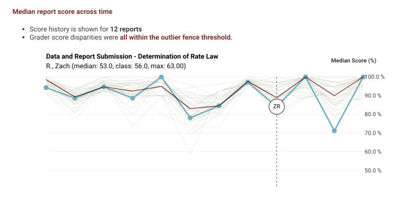
The Score History tab gives you this information in an easy-to-understand format. The graph of median scores awarded by TA over time can let you quickly see for yourself whether any of your TAs exhibit a systematic bias in how they assess their students relative to their peers. While we should expect some naturally occurring variation over the term, we should still anticipate some reversion to the mean as TAs grade work over the semester.
4. Sections by meeting time during the week
Feedback and grading are important, but TAs are also instructors—they need to come prepared for the experimental procedure that week and help out students equitably across their weekly workload. A TA should be just as prepared for their 8:00 AM Monday section as their Wednesday afternoon one. However, as a realist, you recognize that these journeymen-researchers also become stretched thin as the semester progresses. This makes it important to monitor whether any uneven instruction or learning outcomes are occurring by day of the week.

On the By Section Time tab, you can get a high-level glance of where median scores for each of your sections are situated relative to the aggregated medians—both within a single day and across a week. This can give you insight into any specific disparities that may not appear at the TA level but may be relegated to the section or even systemically at the level of the day of the week.
5. Compare TA grading against system grading
One of the unique aspects about how Labflow reports are graded is that most reports contain a blend of items that are graded by the TA themselves along with items that can be configured to be automatically graded without requiring TA input. This gives a unique vantage point into how the Labflow system believes a student is doing on a report relative to how their TA assesses that same performance. If grading is happening in an equitable way, we would expect to see some natural variation in these values, but any obvious outliers should give cause for concern.
On the Hand vs. Auto Grading tab, we get a summary of this multidimensional dataset organized by TA, separated by how the items on a report were graded. Outlier cases are flagged for you both in plaintext and by the use of the color red. The number of students impacted by that TA can be inferred by the size of the bubble.

Improve Your Flow With Labflow
At Catalyst Education and Labflow, we firmly believe that catching a problem before it becomes problematic is the most effective way to save yourself time by preempting those frantic emails and office visits. It is a critical mission of ours to make the work of running a laboratory course easier. While we may not be able to prevent every student meltdown in your office, we believe that armed with timely information about your course, you can catch issues before they bubble over into meetings and emails that take up your time.
We are continually building and enhancing Data Insights and we are excited for you to get a firsthand experience with this component. Data views are changing rapidly and new features are being added regularly to meet client needs and interests. If you would like to schedule a demo, please book an appointment. If you have questions or would like to see new features added to Data Insights, please contact dane@catalystedu.com.